
So Many Fairs, So Many Colors

Image courtesy Salone del Mobile.Milano. Photo by Diego Ravier
It seems everyone was waiting until September to test the waters for live events. Even though Delta numbers were surging, it didn’t stop design aficionados from getting back to what they love most. For someone who follows design, it’s been both exhilarating and exhausting. As I wasn’t able to make it to the European shows, I’ve spent the past few weeks poring over all the press photos, social media posts, blogosphere, and buzz to put together the comprehensive report on what to take away, starting with color. From rusty reds to vibrant yellows, deep greens to tranquil blues, the September fairs welcomed us with a rich rainbow emerging from the gloom of the past 18 months. Here are the prominent trends to look for in 2022.
Muted Earth-Tones
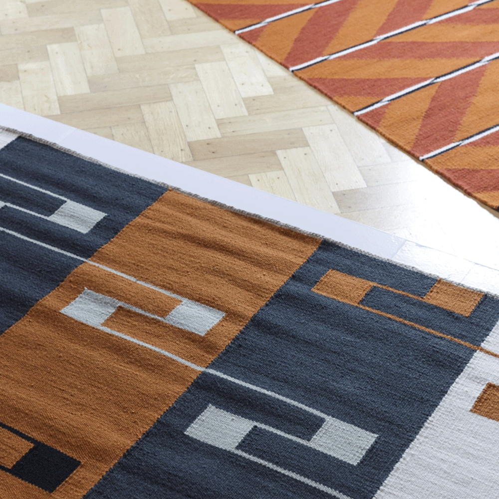
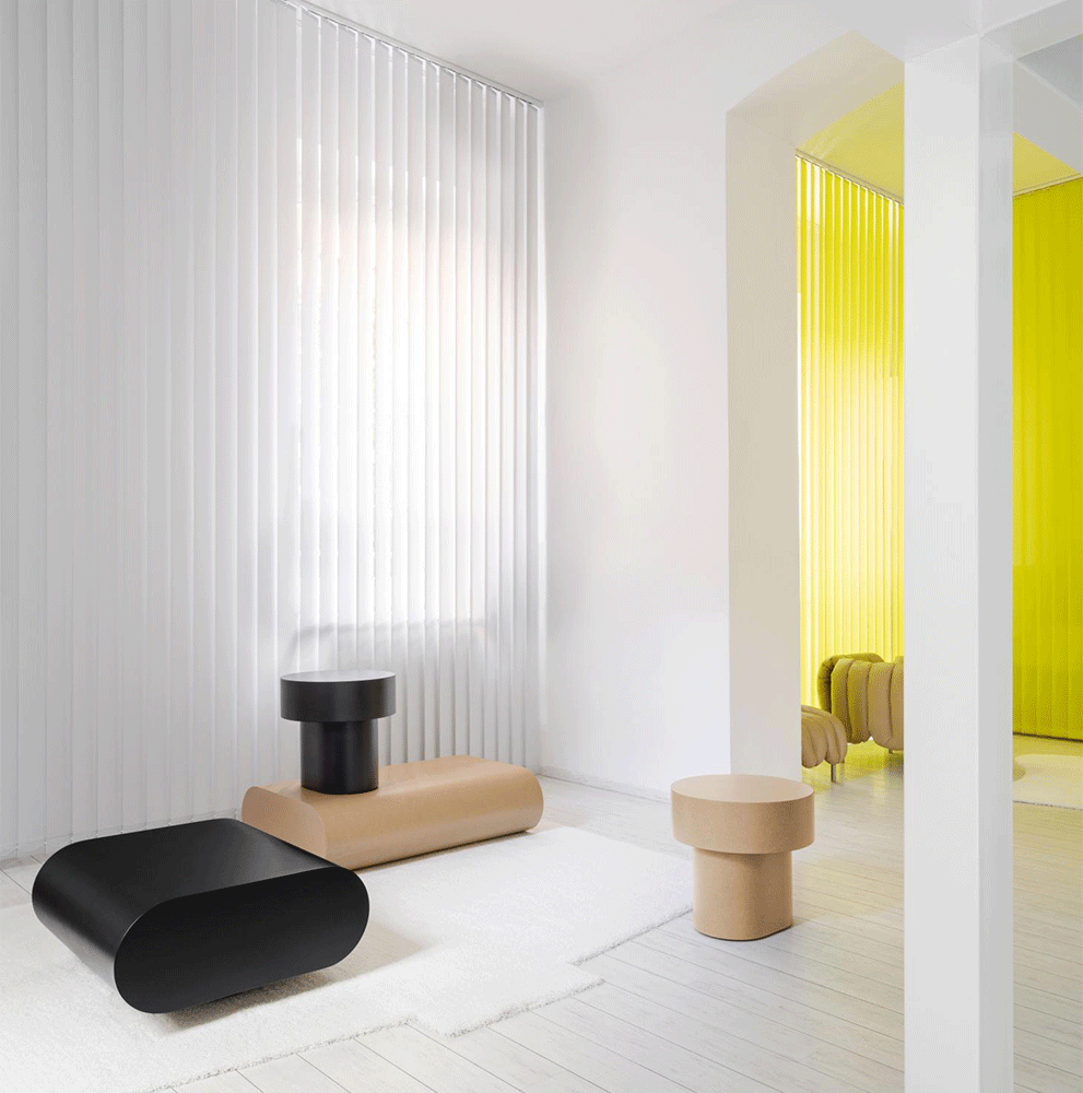
Gone are the days of boring brown. Today’s toasty colors like rust, brick, and terra cotta remind us of the earth, link us to the land, and embrace reddish-brown tones for all their richness. I found these colors everywhere—on chairs, pillows, walls, and carpets. It appeared on upholstered velvets, woven textiles, and hand-painted plates. In past years, designers sought to bring the outdoor in with deep greens. While forest colors remain popular, there’s nothing like reconnecting with the Earth by embracing the very soil with which it is formed.


Soothing Blues
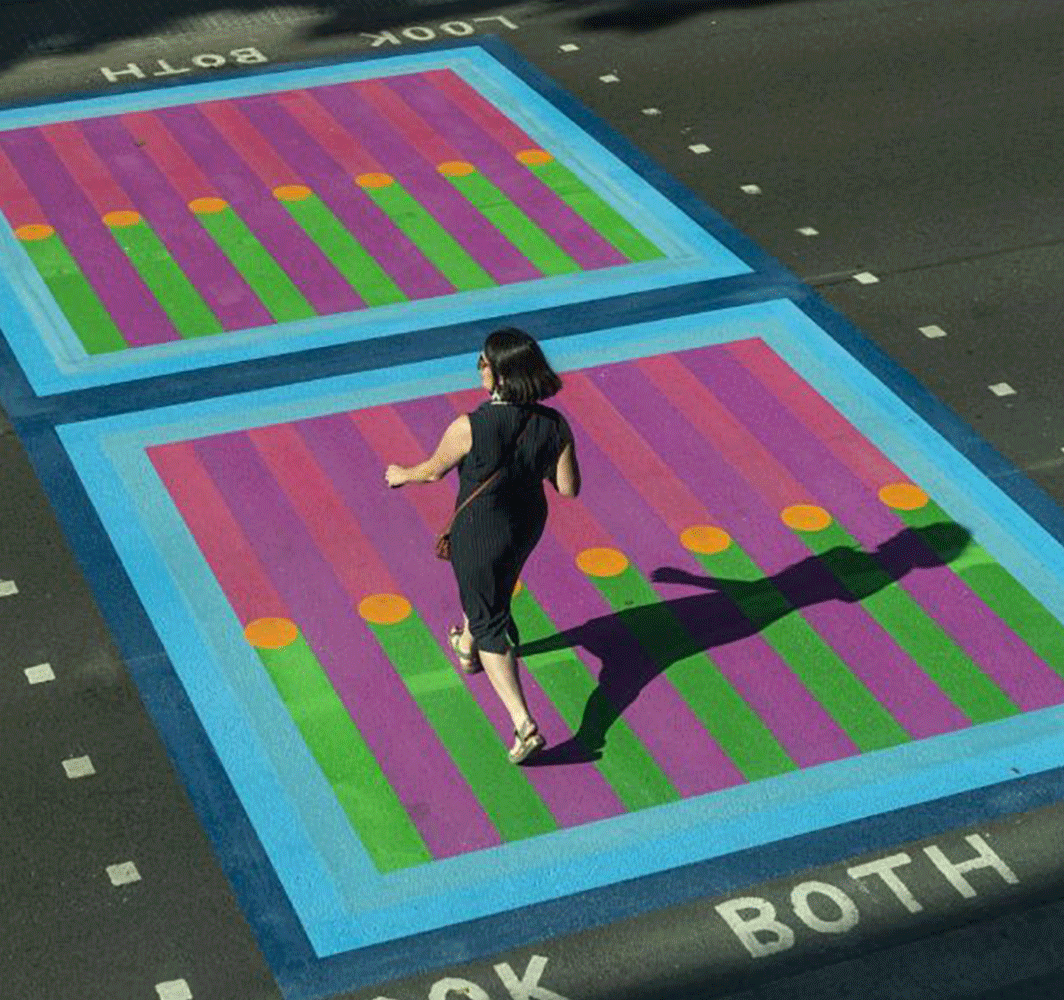
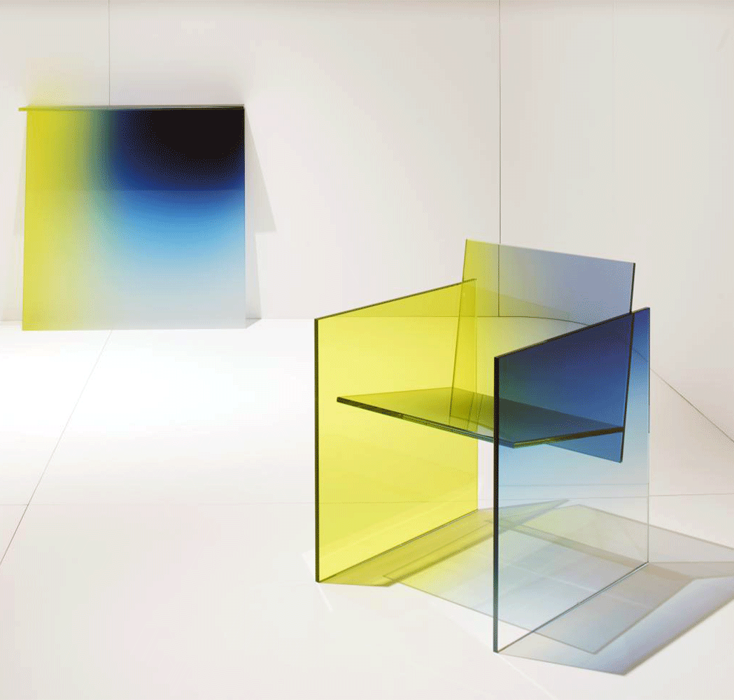
After a year of chaos, the world longs for the calming effect of blue. And not just any blue. Ultramarine tops the charts in the best new color category. Both vibrant and calming, ultramarine plunges us into a sea of crystal-clear deep blue. It seemed to appear everywhere—quite literally thanks to the Creative Region pop-up mobile that traveled around Milan and Vienna during their respective design weeks.
But if you long for more comfort than what ultramarine offers, not to worry. Blues appeared in just about every shade. Light blue sofas were prominent at Supersalone. Turquoise demarcated the crosswalks in London. Cobalt painted the plates in Paris. So it doesn’t matter which blue you choose. But you’d better choose (at least) one.


Eye-Popping Accents
Golden yellow, a color originally popularized by GenZ, remains a go-to favorite for bright accents. Today, the sunshine color has grown up, taking a prominent role on chairs, pillows, and accessories in tones of turmeric and daffodil. But move over yellow, there’s a new kid in town. And she’s vying for the top spot as everyone’s favorite accent color. Make way for chartreuse (or acid green). Is yellow turning green with envy?
Like freshly sprouted leaves in spring, chartreuse has been popping up on my radar more and more. The color of renewal and regrowth, she symbolizes all our hopes as we emerge from the pandemic. Mark my words, we’ll soon be seeing a lot more of this color in the coming year.


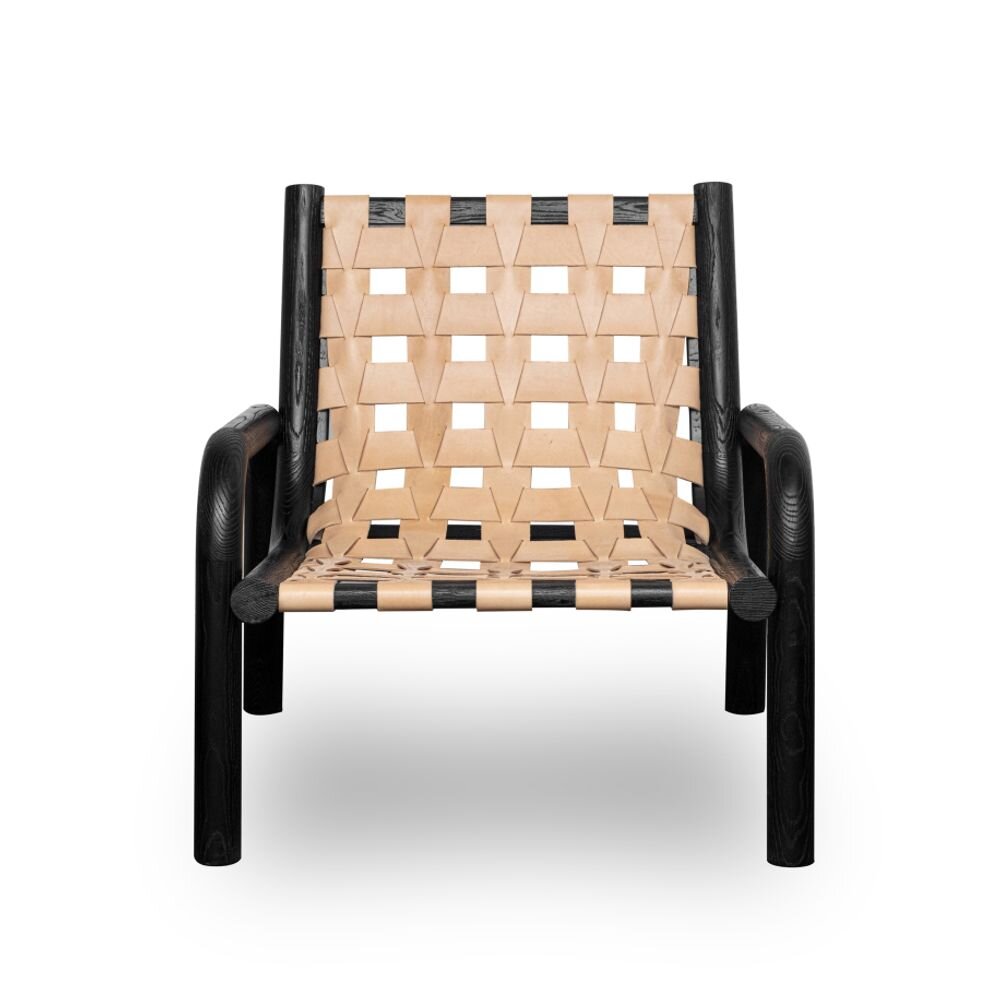
Charred Blacks
Ah, black. You are the rock in this sea of color. And oh, have you matured.
Matte black walls emerged as a trending treatment in 2019. In 2020, we were seeing it on window casements and fixtures. Today, matte black is found on everything from furniture to tableware to lighting. Black makes a perfect neutral to the cornucopia of colors listed above. Though not typically described as an earth tone, matte black is the color of charred wood and wrought metal. For centuries, the Japanese have used a technique called shou shugi ban, or charring wood, as a type of preservation. Black reminds us that our planet needs to heal, but also that there is beauty in its resiliency. Far from somber, matte black is a color of sophistication and wisdom.


I’ll be rolling some deep dives in the coming weeks, so stay tuned. Here’s a brief preview of what’s in store:

Chaos Rug by Emko creates a party-like atmosphere every day of the week.
Neo-Natural in an Imperfect World
After months of living in sweatpants, the days of expected perfection are over. In its place, design has embraced a love of imperfection. Rough, raw, and natural surface textures are having their moment. In addition to being an aspect of Neo-Natural, the quest for imperfection seems to be vying directly against our previous quest for clutter-free order.
Making Waves
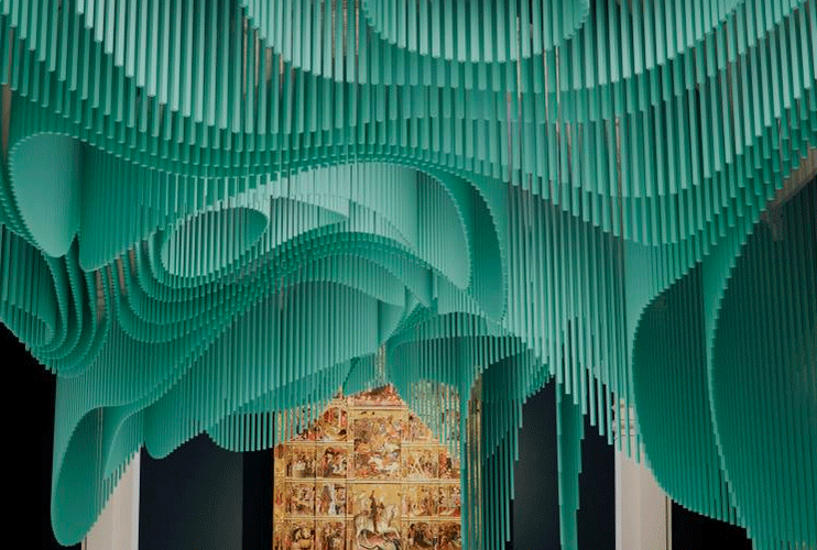
Medusa installation at the Victoria & Albert
If you hope for a more refined look, there were plenty of other objects making waves. Diaphanous and layered, these patterns found themselves frequently on ceramics, carpets, and small objects, but the effect was also used in larger elements like SFAP Sou Fujimoto Atelier Paris’s installation Medusa, presented at the Victoria & Albert Museum during London Design Festival.

Dior Maison invited 17 artist/designers to reinterpret the iconic Louis XVI medallion chair in Milan.
Wait, What Decade is This?
For the design world, the answer is “it’s complicated.” In addition to Memphis representing all things ‘80s, we are also still seeing a lot of color and blobs from the ‘70s, and as well as pastels, inflatables, and other tropes from the ‘90s. On top of that, artists and designers are offering a refreshing take on the classics and regional traditions. All of this historical reinterpretation is part and parcel of the macro trend, a new post-modernism.

Studio Drift and Superblue presented Meadow, an experiential installation at Design Miami. Visitors were treated to an ethereal display of dancing “flowers” that react in time.
The Trend We Cannot See
Lastly, let’s talk about the trend we cannot see. How does the demand for corporate transparency, coupled with a youthful desire for Cottagecore and romance, affect design? I’ll be revealing it all in October so stay tuned!